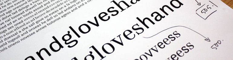

I’ve started working on the italics of Calluna. These are just first impressions … so everything is subject to change at the moment and of course spacing is very very rough.
+++ update :: August 17th +++

I’ve started working on the italics of Calluna. These are just first impressions … so everything is subject to change at the moment and of course spacing is very very rough.
+++ update :: August 17th +++
Filed under In progress

Looks very sexy. I don’t know if I like the lower-case ‘g’. Just keep on playing with Calluna Jos!
Bjorn
Pingback: RANDPOP | exljbris Font Foundry: 8 schöne Schrifttypen für lau
That’s fast! Thanks for commenting Bjorn! I’ll keep fidling around with Calluna and also with the lc g 🙂
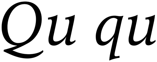
Wow, I love it. And I personally like the ‘g’ and the ‘k’. I am curious to see what the upper- and lower-case Q’s look like.
Can’t wait for it. 🙂 🙂 Lookin’ good already! (But I _do_ like the l.c. ‘g’)
It looks Dutch!
And very good!
Thanks Ben, I’ll post images of the u&lc Q soon.
That’s great Billy. I had another look at the lc g and I’m going to stay with it for a while.
@ Barry: 🙂 Thanks!
You really are a tease don’t you Jos? 😉
that’s a beautiful cap Q, but it gives me an idea… Have you thought about making the ‘Qu’ (and maybe the ‘qu’) a contextual alternate in the italic form so that they elide? Most Latin-based languages never see the ‘q’ without the ‘u’, so so it makes since to have them as a ligature/CA. I don’t know what the roman form looks like, so I don’t know whether a more cursive ‘qu’ would be a natural extension or actually a stretch.
@ Bjorn: I wasn’t born one. It’s just the way progress goes 😉
@ Billy: Thanks. Good thought! I did something similar with Fontin Serif lc q_u (still waiting to be finished). I’ll give it a try soon (also with Q_u).
another masterpiece ! i really like the way you build the low serifs… mixing “elzevir” and “didot” style ?
Thanks Hugo! No styles mixed btw … The serifs more or less developed in a logical/natural way.
Dear Jos!
Your types are extremely beautiful! You sure have talent and patience for the type business.
It’s a daring move to make fonts available 4 free. Keep on good work.
Respect,
Ciril
Comics author & illustrator, Slovenia
Wow, that looks beautiful. I really like the curves of your fonts =)
Thanks a LOT for making *such fonts* for free – its wonderful and somehow like birthday presents… 🙂
Jos, thank you so much for your work and for making it so accessible. Don’t know whether you had types out back circa 1990 when I began working, but you’re certainly a Godsend to novice designers nowadays. Anyhow …
I like the Calluna family quite a bit. I can’t wait till it’s finished. Along with the Fontin family–I particularly like that there’s a complementary Sans–it will be one of the types I feature in an article I’m prepping for my blog (http://www.tianodesign.com/blog). I will also, perhaps, feature another one or two of yours.
Full credit and, above that, the props that you deserve will be given.
I believe that type designers definitely deserve fair earnings for the types they bring into the world, but this article, about setting up a free typeface library for book design work, is geared toward student book designers and those just starting out professionally as book designers.
Based on my own experience, starting out is an expensive proposition. Getting all the necessary tools together–hardware and software–and then having to make an investment in types so that you don’t have to rely on the resident fonts that come with your computer and printer can be a very formidable task.
So I wanted you to know that I planned to at least discuss a place for your work in such a recommended library for beginners.
Thank you Ciril and Mari!
@ Stephen: I’m very glad I (or my fonts) can make a difference for starting and student designers. Calluna will be a partially paid typeface (like Museo and Anivers), but the price will be very low.
Thanks in advance for featuring my type. I’ll certainly keep an eye on your blog!
Pingback: EinGrafikbüro · “Design is thinking made visual” / Saul Bass
Jos,
Beautifull as always. Maybe a little bit more ‘Dwiggins’: some irregularity. Perhaps a sharper angle on lc g.
Thanks for commenting Arjen! It is kind of homogeneous right now, but I do like it at this stage. I still have some testing to do to see if some irregularities are needed to enhance legibility.
I have a few questions about being able to use your fonts!
Im entering first-year university for Landscape Architecture and I’m in the process of staring a small company selling t-shirts and stuff that promote protecting the environment and being eco-friendly. I’m planning to have some of the profits for charity. I started creating the graphics for it, however, I was looking for fonts that I could use in my designs and in the logo. I was looking around for free fonts, and I stumbled across your page.
I was wondering about using them, if thats actually okay or do I have to purchase them to use them in my designs? (I’m a bit confused about how free fonts work). My goal is to only use a set of fonts from one designer for my graphics and then eventually when I set up a website to acknoledge them in the thank yous. If you could sort of explain this to me, that would be greatly appreciated!! Thanks!
Eagerly awaiting the release of Calluna, Jos!
Awesome work — thank you!
Jos, I’ve just bought your Museo family and can’t wait to use it. Hopefully, if everything goes in the right direction, I’ll use it in a free weekly here in Rome. Otherwise, other projects will come in the next months.
I thought to drop a line and thank you for the nice works you’ve done. My best wishes for the future.
Sergio
Leann, my free fonts don’t need to be purchased otherwise they wouldn’t be free. Not sure about your goal. Just go for the fonts you like and also match with what you want to do with it.
@ CircleReader: More than welcome. Thanks!
@ Sejo: Thanks very much for the purchase! I hope Museo fits and will do a good job. Best to you too.
Jos,
Just wanted to write a note to say thanks for all the work you do and give away from free. As a student in a highly competitive Graphic Design program we often need to look fabulous for cheap. I am constantly searching for ways to supplement the schools rather outdated and lacking collection. Your fonts will be invaluable to me and many other starving students who can’t afford many of the lovely fonts out there!
Thank You So Much!
-Jess
Glad to to able to make a difference Jess. Thanks for commenting.
Just wanted to say thank you very much for all the fonts. So lovely.
Hi Jos,
I’m Mattia Cuttini from Italy and I work in a small small graphic and web agency called Zero.net.
I’m using your free fonts quite often these days.
If you want I can send you some shots of my works with your fonts.
I haven’t find around yor mail so I’ve got to communicate you this way! 😉
I really appreciate all your work, you’re so original and accurate in your fonts. I really like to us them, it’s a real pleasure.
Cheer
,
matt
martiac #et# gmail -dot- com
Doens’t relate to the topic but i just wanna say thank you for this great fonts! You are doing a great job. I love your fonts maybe I even support you with buying a Museo 900 :)!
Keep up the good work!!
Mattia, I would love to recieve some pics of your work. You can send them to: comment *at* josbuivenga *dot* demon *dot* nl
@ vowels & accessoire: Thanks!
Simply beautiful font… I can’t wait to use this one. In appreciation of all the amazing fonts you give away for free, I just purchased Museo Sans.
Thanks for that!
Gorgeous!
I love the lc k, y, and t. I’m quite unsure about the lc g though. Perhaps a curve that somehow resembles lc y?
I will have another look at all characters. Maybe I’ll change this g and offer it as a contextual alt.
Anything new on the status of Calluna? How close to a complete–roman, ital, bold, boldital, with real small caps, lining fingures, accents, etc.–are you with it?
Still haven’t found quite the right book design project for the Fontins, but I’ve a hunch I’d have an easier time finding one for Calluna. (I’m not sure what influences I feel when I look at it–I’m terrible at knowing what fonts are what. (Then again, I never see the resemblance of babies to their parents.) I’d have to look around for a suitable sans to pair with Calluna.
Anyway, just wondering.
Working on it at the moment, but I was a bit short of time the last month. Calluna will come in the weight you mentioned and with small caps. The suitable sans for Calluna can only be Calluna Sans 😉 I’m sure Calluna will resemble some other font. If you come across it let me know. BTW I expect it to be ready somewhere early 2009.
That’s great news, Jos, about Calluna! I’ll keep watching for it. Any time you get around to the “very low” price for the fonts in the Calluna family, please let me know. Also, will you really eventually put together a Calluna Sans? That, obviously, would be terrific, too.
And I may have found the book I want to use the Fontins in. Haven’t really struck the deal yet. I’ll have to accept a creative payment arrangement, which I don’t usually do. But I’d like to work on this book enough that I may go for it. It’s a book that might “matter”. Add to that the opportunity to use types for which I’ve been waiting to find the right project, and I’m hoping to bring this project off.
Thanks Steve. Calluna Sans will absolutely see the lights of day.
Please keep me posted about the book!
Absolutely elegant! Beautiful work…
Thanks, Matthew!
Is it early 2009 already? 😉
Just counting the days, aren’t you 😉
Yes, we are! 😀
Me too 😉
Absolutely gobsmackingly gorgeous, Jos.
_Amazing_ work yet again,
I am extremely happy that someone giving away a large body of their work for free is shooting out into the stratosphere of recognition and respect. Huge props to you… Panasonic?!?
I’d say keep up the good work, but it would be redundant. Look out Zapf.
PS: Consider the license issue again please. I and a good number of people are begging you to…
Thanks for dropping by again, Troy 😉 I’ll think about the license issue.
Really good font! Great work
I would wait Calluna
Thank you!
Pingback: exljbris Font Foundry: 8 schöne Schrifttypen für lau : EinGrafikbüro